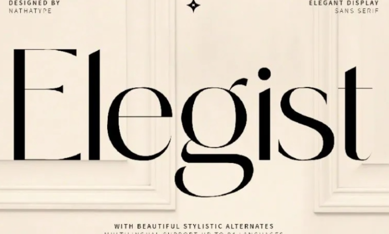
How to Use Sans Fonts for Clean and Modern Design

Sans fonts, or sans-serif fonts, are a cornerstone of contemporary design, known for their clean lines and minimalist appearance. Unlike serif fonts, sans fonts lack the small strokes at the ends of letters, giving them a sleek and modern feel. This simplicity makes them highly versatile for both digital and print applications. Understanding how to use a sans font effectively can enhance readability, improve user experience, and create a polished, professional aesthetic for any project.
What Makes Sans Fonts Effective
Clarity and Readability
One of the primary advantages of sans fonts is their clarity. The absence of decorative strokes makes each letterform simple and easy to read, especially at small sizes or on screens. Fonts like Helvetica, Open Sans, and TypeType’s TT Norms® Pro are popular choices because they maintain legibility across multiple mediums, from websites to mobile apps.
See also: Click, Set, Earn: The Best Online Tools for Passive Income
Modern and Minimalist Aesthetic
Sans fonts convey modernity and minimalism, making them ideal for contemporary brands, tech companies, and startups. Their simplicity communicates efficiency and innovation, giving designs a forward-thinking appearance without overwhelming the viewer.
Versatility Across Platforms
Sans fonts are highly adaptable. They work well in headings, body text, and user interfaces, whether in print or digital media. This versatility makes them a go-to choice for designers who need consistency across different platforms.
Common Applications of Sans Fonts
Web and Mobile Design
In digital environments, readability is key. Sans fonts render well on screens of all sizes and resolutions. Websites, apps, and digital advertisements frequently use sans fonts to ensure that content is legible and visually appealing. For example, TT Norms® Pro from TypeType is optimized for UI and web use, providing clear letterforms that enhance user experience.
Branding and Marketing
Sans fonts are ideal for building modern brand identities. Their clean appearance communicates professionalism and innovation, making them suitable for logos, product packaging, and social media content. Brands that want to appear approachable yet sophisticated often rely on sans fonts to maintain a consistent and appealing visual identity.
Print Media
Though commonly associated with digital design, sans fonts are also effective in print. They are excellent for posters, brochures, business cards, and magazine layouts, particularly when paired with complementary fonts. Their legibility and simplicity help convey information efficiently while maintaining a polished look.
Best Practices for Using Sans Fonts
Limit the Number of Fonts
While sans fonts are versatile, overusing multiple styles in a single design can create visual clutter. Stick to one or two sans font families to maintain cohesion and a clean aesthetic.
Pair with Serif Fonts for Hierarchy
Combining sans fonts with serif fonts can establish a clear visual hierarchy. For example, using a sans font for headings and a serif font for body text adds contrast and helps guide the reader’s eye through the content.
Optimize for Readability
Consider font size, weight, and spacing to ensure optimal readability. Light or ultra-thin sans fonts may look elegant, but they can be difficult to read on screens or at smaller sizes. Testing your font choices in context ensures clarity across all platforms.
Maintain Brand Consistency
Use the same sans font across digital and print materials to strengthen brand recognition. Consistent typography reinforces a professional image and helps audiences quickly identify your brand.
Creative Uses of Sans Fonts
Sans fonts aren’t limited to simple layouts; they can also be creatively applied to enhance visual interest. Designers often experiment with bold weights, condensed styles, and unique letter spacing to create dynamic headers or impactful logos. Additionally, combining sans fonts with bright colors, geometric shapes, or modern design elements can create a visually compelling composition that draws attention.
Conclusion
Sans fonts are a versatile, modern, and highly readable typeface option suitable for a wide range of design applications. Their clean lines and minimalist style make them ideal for websites, mobile apps, branding, marketing, and print materials. By understanding their characteristics, applying them thoughtfully, and pairing them strategically with other fonts, designers can create engaging, professional, and cohesive designs. Sans fonts are not only functional—they are a fundamental tool for communicating clarity, modernity, and style in any design project.


